BDS Blog

BDS Blog
UI/UX design for a marketing blog

The Main Feed
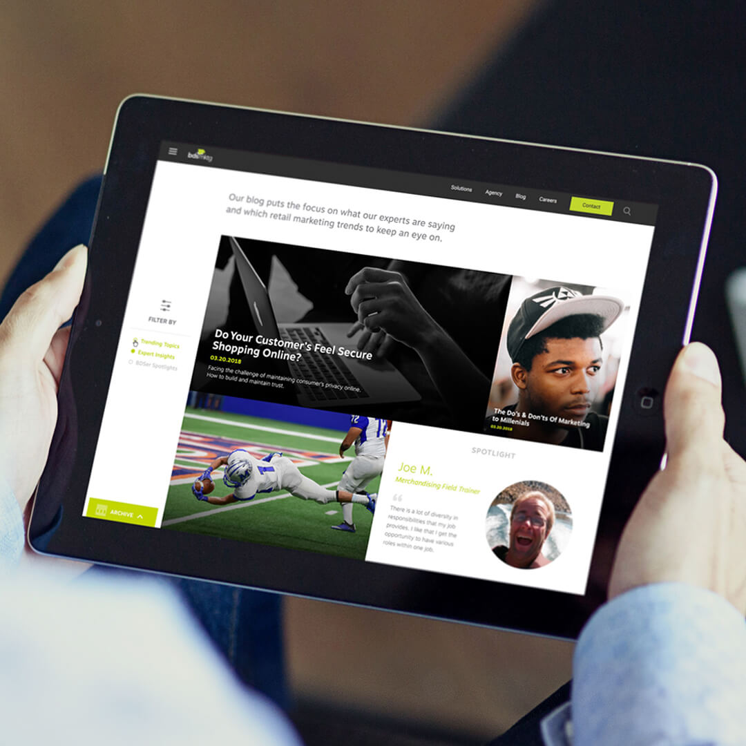
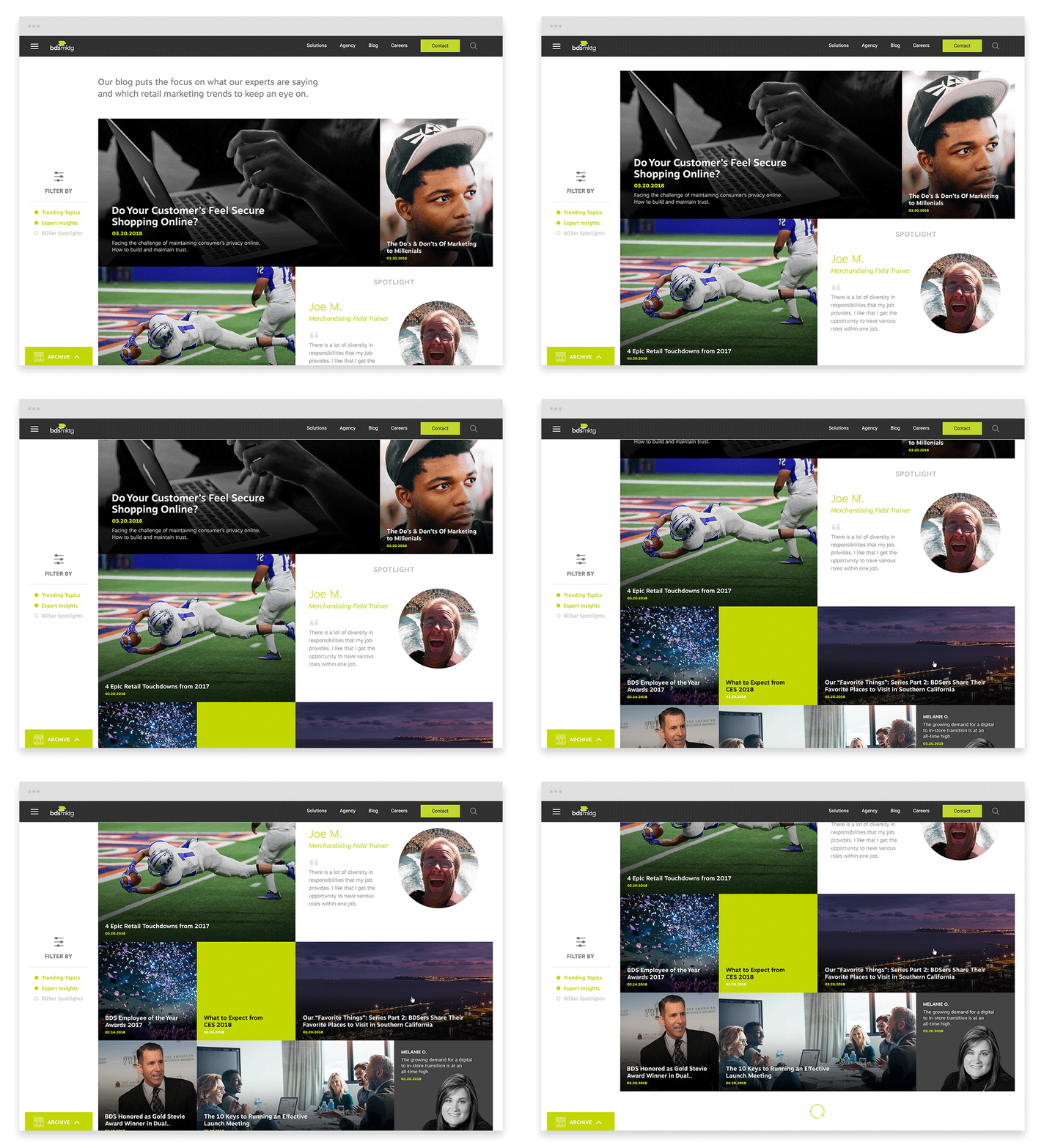
This is the central hub where blog posts are populated. The blog allows for several key sizes and post styles.

The Filter Bar
A “sticky” sidebar filter of categories allows you to filter the posts in the feed.

The Archive
The blog had a bunch of old archived posts. How do you quickly navigate through all that content? An archive tab that allows year/month navigation was the solution.

Individual Post
Posts pop up in a modal box with internal navigation links, including: sharing, contact, and tags.

Contact Us Flyout
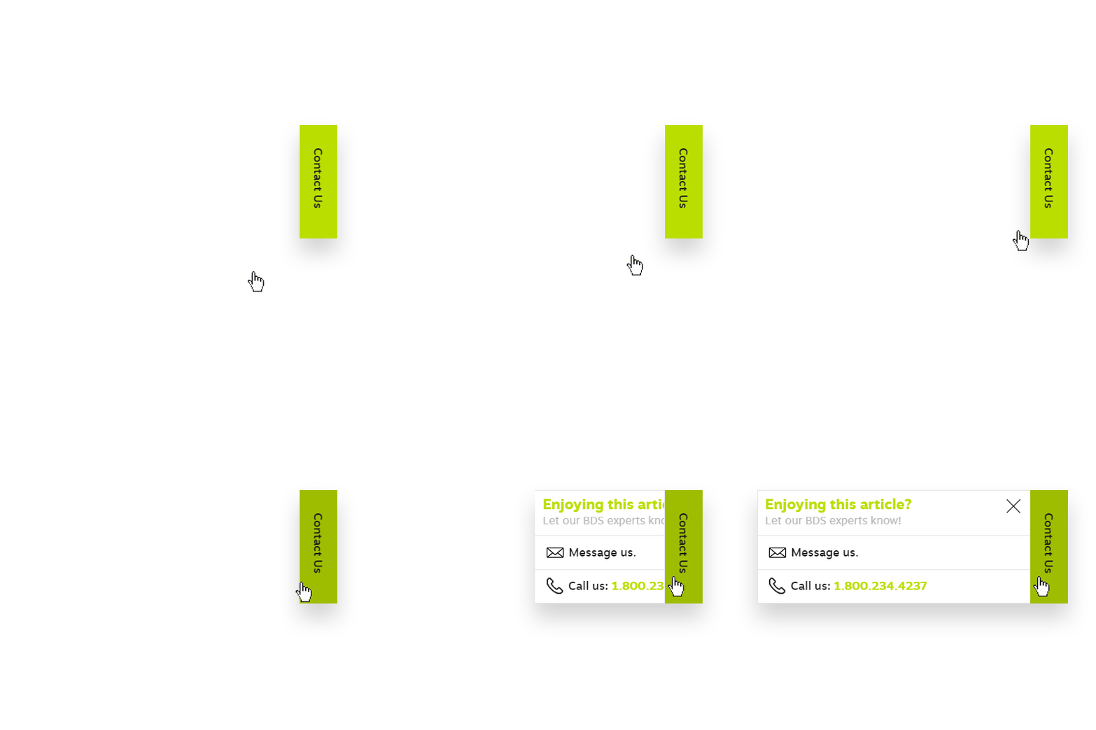
This tab allows a direct line to get in touch with the expert(s) who wrote the article.

