Nature's One
UI/UX

Nature's One
Homepage design for an organic baby formula company

The Hero
Design isn’t making things look pretty. It’s visual communication. Show them what’s important, why they should care, and what to do about it.

Product Categories & Benefit Callout
Color-coordination often helps guide a users path, whether they are aware of it or not.

Trending Items & Callouts
Mixing product links and brand pieces can help balance the page flow. And giving the user a variety of paths encourages a user to engage with the site.

Mobile View
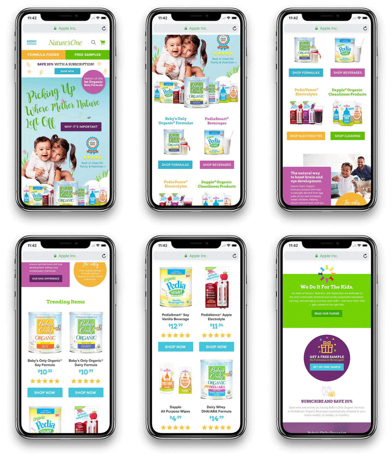
The hero, product categories, and special callouts — custom tailored for mobile compatibility.

Subscription & Testimonials

